Humans are visual beings, so when we learn something new – whether simple or complex – it usually helps when we can visualize whatever we want to know.
On that note, our team at Swimm is happy to announce our integration with Mermaid!
Swimm’s integration with Mermaid provides software-related use cases to get the most out of this amazing combination.
What is Mermaid?
Mermaid is an open source diagramming and charting tool that lets you create flowcharts and diagrams with Markdown-inspired syntax. It is a wonderful way to visually explain flows, dependencies, and other aspects of your codebase. Mermaid won the JS Open Source Awards (2019) for “the most exciting use of technology.” 🥇
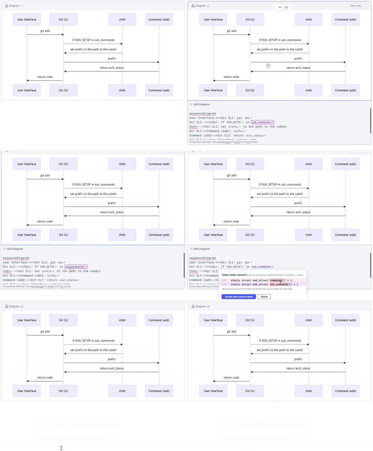
Understanding a codebase or parts of it can be overwhelming and complex, and visualizations can significantly help with that. With Swimm’s Mermaid integration, you can create diagrams and charts that automatically remain up to date as code changes.
Mermaid + Swimm = up to date Diagrams 🤯
You can now create and edit Mermaid diagrams straight from Swimm’s editor. We even included sample diagrams to get you started:
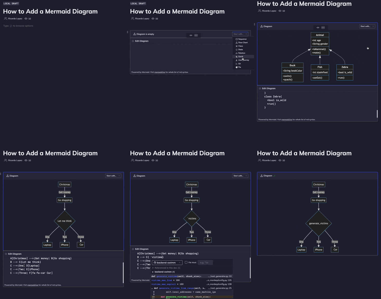
We’ve taken this beautiful tool and extended its functionality with Swimm’s Smart Tokens. Type a backtick ` within your diagram labels to code-couple constants or variables. You won’t need to worry about the impact of refactoring on your documentation and renaming those values referenced in your diagram. This means that diagrams in your documentation stay up to date with your code 🤯
The many benefits of diagrams in your docs
The impact of diagrams in your documentation are many. Here’s a closer look at the benefits.
Architecture overview
When approaching a large codebase, there is so much to learn, and it is quite easy to get overwhelmed. A good architectural diagram explains the different logical modules of a codebase and the main interactions between them.
You can use smart paths as well as definitions from the entry points of each module.
Here is an example from Sentry’s documentation:
A flow in the code
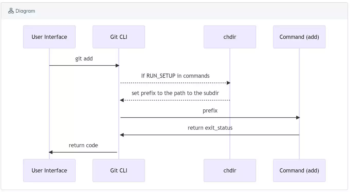
Logical code paths are hard to follow when they involve various areas of the code that interact with one another in a way that is not necessarily obvious. Imagine a straightforward web app where to fully understand the flow. You would need to go back and forth between various parts of the frontend and backend.
Here is another example, with a sequence graph showing Git commands:
Events pipeline
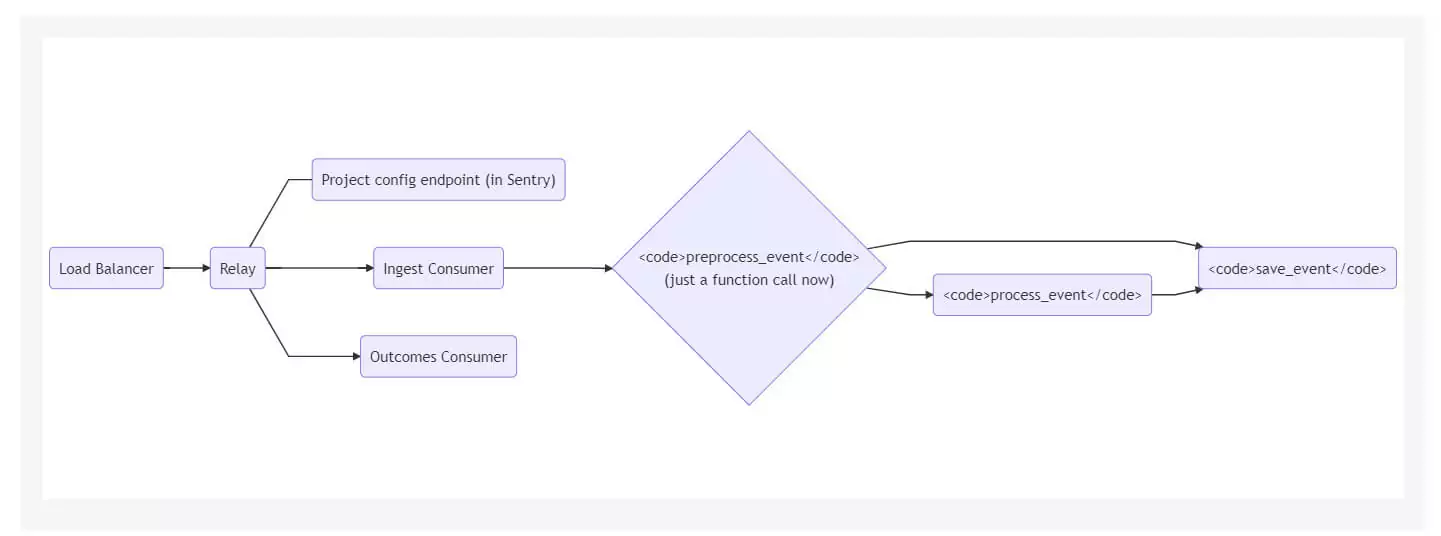
Pipelines of events are so ubiquitous they deserve a section of their own. When an event gets transmitted between different parts of the system, visualization can help explain the flow.
For example, consider the following diagram that explains the path of an Event through Sentry’s Relay Server Application:
Multi-repo dependencies
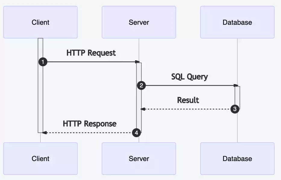
The case described above regarding a flow in the code becomes even more complicated if the code is spanned across multiple repositories. For example, a system where the frontend code is in one repository and the backend is in another. The problem worsens as the number of repositories involved in the flow increases. Understanding the flow becomes straightforward when a document contains code parts from all relevant repositories.
Therefore, a diagram that describes code flow spanning multiple repositories is essential.
At a basic level, we can describe the flow of operations between the different repositories, and the document can connect each step of the process like this:
Another option is to have a more detailed representation relating to specific entities within different repositories, such as the following Swimm diagram:
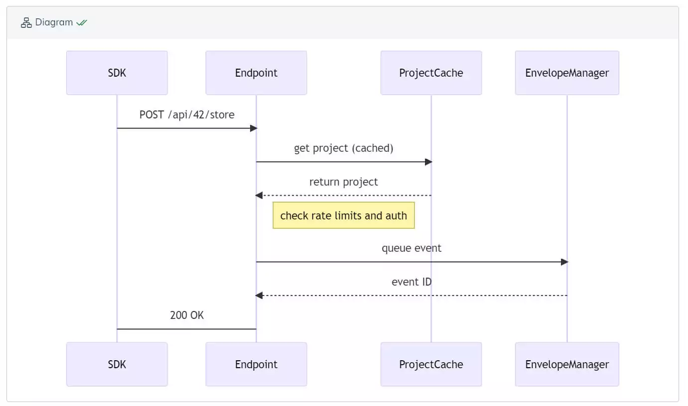
We can see communication taking place between 4 different repositories.
A class diagram
Describing classes, and especially how they interact with one another, is a common use case for diagrams.
For instance, the following diagram is taken from the wiki of Taproot:
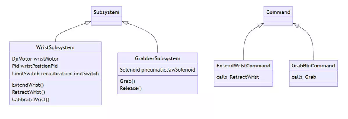
This diagram explains the usage of the comprised command, a “layer built on top of the Command class. The key idea is that a comprised command is an encapsulation of multiple commands.”
A process
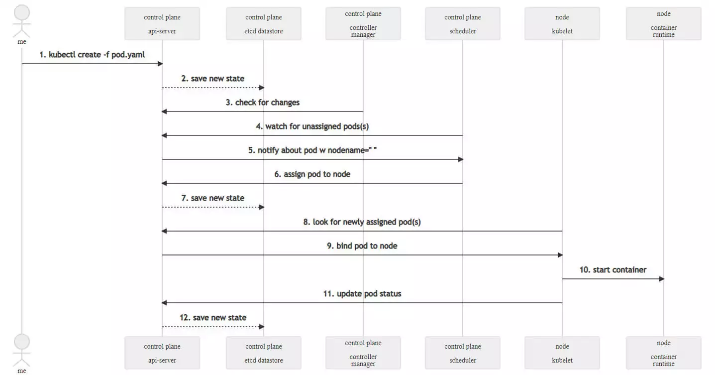
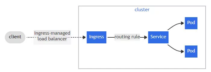
Sometimes, a process requires a few steps that may or may not be directly linked to a part of the code, or something may happen on a remote service you cannot access. Especially in these cases, it may be difficult to understand the entire process by just looking at the code.
Consider this example of system flow between K8s components to start a container (from Kubernetes’ documentation).
Here is another example (from k8s documentation, “What is Ingress”):
User journey
When creating products that interact with users, it’s crucial to understand how the flow of the code supports the user journey. What is the happy flow, and what are the other flows? Do you really cover all cases?
Using Swimm’s Mermaid charts, we can create user journey charts that couple the user journey and UX with the implementation, ensuring they are aligned and the link between them is clear.
Bottom line
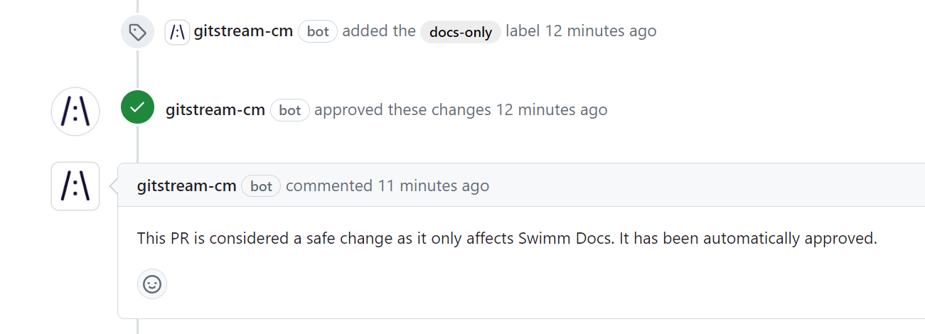
With Swimm’s Mermaid integration, you can create diagrams that automatically stay up to date as the code evolves. This opens up the possibility for new use cases incorporating the powerful tool of visualization, and the impact for our dev teams around the globe has been tremendous. If you’d like to see Swimm’s Mermaid integration up close, sign up for a 1:1 demo.
